
Daniel Nevins, CFA, has invested professionally for thirty years, including more than a decade at both J.P. Morgan and SEI Investments. He is perhaps best known for his behavioral economics research, which was included in the curriculum for the Chartered Financial Analyst® program and earned him recognition as one of the founders of goals-based investing. He has an economics degree from the Wharton School of Business and a degree from the University of Pennsylvania’s engineering school. He is also the author of the recently released book Economics for Independent Thinkers.
Visit Daniel’s website here: nevinsresearch
We’ve produced some research over the years that we’d love to see the powers-that-be react to, but none more so than our look at financial flows during the QE programs.
By netting all lending by banks and broker-dealers and then comparing it to the Fed’s lending, we stumbled upon a chart that seemed to show exactly what QE does or doesn’t do. But what QE doesn’t do was the story, and it could not have been clearer or shown a more stimulating pattern. What we found in Excel was like stepping from a shady trail into a sunny vista.
Here’s the updated chart, which we dubbed the “argyle effect” and looks even sharper than it did when we first produced it in 2014:
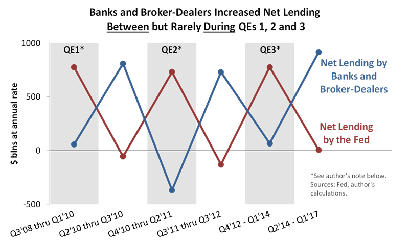
Click on image to view larger version
We like the chart because we’re just as confirmation-biased as the average human—anything that confirms our QE skepticism is cognitively satisfying. And the chart appears to show that QE was largely irrelevant. It merely replaced growth in privately financed credit with growth financed by the Fed. The Fed grabbed the credit-growth baton for QE laps and returned it to the private sector for QE pauses, and whoever didn’t have the baton more or less stood still. As we concluded in 2014, QE is a substitution story, not an addition story.
Many pundits told the addition story as QE was underway. They expected banks to “multiply up” reserves by aggressively expanding their loan books. But reserves never significantly multiplied. We think there are five reasons why the “money multiplier theory” failed:
- High-quality borrowers don’t emerge mysteriously from cracks in the Eccles Building and parade zombie-like to bank loan desks. In other words, credit demand was probably about the same with or without QE.
- QE’s effects on bank balance sheets aren’t quite as distorting as they’re often depicted. Consider that new reserves are typically matched by new deposits, because dealers offering bonds to the Fed get paid for those bonds through their accounts at commercial banks. In other words, QE adds a similar item to both sides of bank balance sheets, which you might not appreciate if your information comes from those who call for banks to “lend out” reserves. That’s impossible—reserves can’t be “lent out”—and it often leads to exaggerated statements about the implications of excess reserves.
- To a significant degree, banks can neutralize excess reserves (and the corresponding “excess” deposits) with financial derivatives and other balance sheet adjustments. They can rearrange exposures to mimic a balance sheet of equal risk that’s not stuffed with reserves.
- Just as importantly, excess reserves flow naturally from banks that don’t want them to banks that don’t mind them nearly as much. Consider that Fed data shows a disproportionate amount of QE’s extra reserves landing at U.S. branches of foreign banks. Those foreign banks might have sound reasons for holding excess reserves.
- The money multiplier theory is inconsistent with real-world reserve management practices. The Bank of England has called it “reverse” to how bank lending and reserve management work in the real world. And the gap between theory and reality is so large that you don’t even need the four reasons above to reject the money multiplier—you just need a healthy skepticism about mainstream theory.
According to our chart, even QE’s wealth effects appear to be poorly understood. If credit growth is the same with or without QE, any effects on bond and stock prices might be more psychological than commonly believed. Or, those effects might transmit mainly through financial derivatives (see #3 above). Some readers may also be asking, “What wealth effects?” We’ll never know for certain if QE boosted asset prices at all. Maybe the bull market only needed low interest rates, a slowly growing economy, the knowledge that our policy honchos wanted asset prices higher, and a soothing narrative that they have the tools to make that happen.
Think of it this way: New borrowers know approximately how many calories they can consume, and after the Fed starts delivering three meals a day, private banks find that their contributions are no longer needed. By necessity, private banks shut down their kitchens, and almost nothing changes economically. We get substitution, not addition.
Getting to the Bottom of the Argyle Effect
To be sure, the argyle effect might not be surprising to the Fed’s policy makers. They might have already looked at the data in the same way we did. They might also believe that QE increased the overall lending trend (referring to the entire period’s lending growth), irrespective of the pattern from one QE to the next. All that said, we’d like to know their reaction.
We’d like to know: Would the Fed’s heads explain the chart pattern differently to our interpretation above? If our interpretation is on the central-bank-printed money, how do they justify their policies? How do they expect the pattern to change as QE unwinds?
Lastly, do they not know what to expect or are they as confused as anyone else about what QE really does? It seems like the latter is a possibility based on public statements by both current and former FOMC members. (See, for example, Bill Dudley here, Kevin Warsh here, or just about anything from Richard Fisher.)
So, we’re asking Fed correspondents to lend a hand nearly nine years after QE began. Here’s a chance to make the discussions more interesting, as inquiring minds would like some answers to the questions above.
Sample Report
5-year economic forecasts on 30+ economic indicators for 127 countries & 33 commodities.